


-
TIME FRAME
Sep - Nov 2022
-
TEAM
Ana Khatchikian
Victoria Gatti
Sietta Meynell
Vincent Rosier
-
ROLE
Research
UX Design
Visual Design
Prototyping
-
TOOLS
Figma
Figjam
Useberry
Photoshop
Illustrator
-
BRIEF
-
02/ DEFINE
-
04/ INTERACTION DESIGN
BRIEF

INTRODUCTION
The Dutch Museum Gift Shop (DMGS) supports cultural heritage and financial independence of museums by promoting and selling their products online. It was founded by Jitske Naberman while working as a web-shop coordinator for the Rijksmuseum. She realized many museums were missing out on the opportunity to sell their unique products to a wider audience through an online shop and started helping museums with their online sales.

CHALLENGE
The aim of the project is to improve the mobile experience of the Dutch Museum Gift Shop and make it easily accessible via the Tropenmuseum website. The objective is to improve responsiveness, usability, and navigation for a more user-friendly experience while balancing commercial needs with cultural communication. The project involves collaboration between DMGS and Tropenmuseum to create a new e-commerce platform for 17 museums in the Netherlands. A heuristic evaluation and proposal have been requested to improve user experience and meet stakeholders' and users' needs.
01/ EMPATHIZE

THE CLIENT
The Dutch Museum Gift Shop (DMGS) supports cultural heritage and financial independence of museums by promoting and selling their products online. It was founded by Jitske Naberman while working as a web-shop coordinator for the Rijksmuseum. She realized many museums were missing out on the opportunity to sell their unique products to a wider audience through an online shop and started helping museums with their online sales.

INITIAL CONTACT
Our team arranged an initial meeting with two stakeholders from the Dutch Museum Gift Shop (DMGS) and Tropenmuseum. We presented a holistic market study, explained the design thinking process, set dates, and planned an agenda. Our goal was to gather as much information as possible during the interview with an emphasis on topics such as challenges, priorities, platform functionality, desired outcomes, and sources of inspiration. The stakeholder from DMGS, Jitske, provided valuable information about her target audience and specific pain points.
“It is difficult for older people to see the website properly: the letters are currently too small and the grey is hard to read. We need some bright big letters that are simple, easy and readable” Jitske — DMGS

SECONDARY RESEARCH
The team researched comparable websites and gathered design references for the DMGS's new e-commerce platform, taking into account the stakeholders' requirements and pain points. This research improved our understanding of the current market and potential design directions for the project. By considering potential references early on, we were able to think creatively and develop a clear vision for the next phase of the project.

QUANTITATIVE RESEARCH
The main target audience is between 25 and 44 and primarily interested in buying unique and exclusive merchandise, such as limited edition items or products designed specifically for exhibitions.
The DMGS website primarily generates sales through desktop, but there is a growing trend towards mobile usage. Jitske wants to take advantage of this by placing a strong emphasis on the mobile version in the new design.
Jitske wants to reach a younger audience, specifically those aged between 18 and 24.
Jitske's behavioural study showed that the target audience is keen on gaining knowledge about museums and their collections prior to making a purchase.
The study highlighted that the target audience is interested in sustainable and environmentally friendly products.

Based on the findings, the focus will be on developing a mobile-oriented, visually appealing, and user-friendly website that is optimised for conversions and showcases the museums' distinct identities, promotes sustainable and eco-friendly products, and appeals to a younger audience by incorporating relevant elements.

Some important points:
“ - The souvenirs or the products often do not fit in my interior. They are often booklets, pens, key rings, something with little added value”
“ - Lack of beautiful books.”
“ - It doesn't add anything to the visit for me, so I think it's a waste of money”
“ - I pay the ticket and rather support the artists directly” “ - Stuff is too expensive most of the time”
“ - Often odds and ends and books. I only read e-books" “ - Don't think it's worth the money”.

QUALITATIVE RESEARCH
To gather insights and feedback on the DMGS's current e-commerce platform, user interviews were conducted as part of the research process. Participants were recruited based on factors such as age range, location, art and culture interest, and museum visit frequency, with a total of five interviews conducted:
Frans (58) from Amsterdam, Mimi (31) from Amsterdam, Emiliano (35) from Berlin, Brenda (30) from Berlin, and Hubert (73) from Paris.
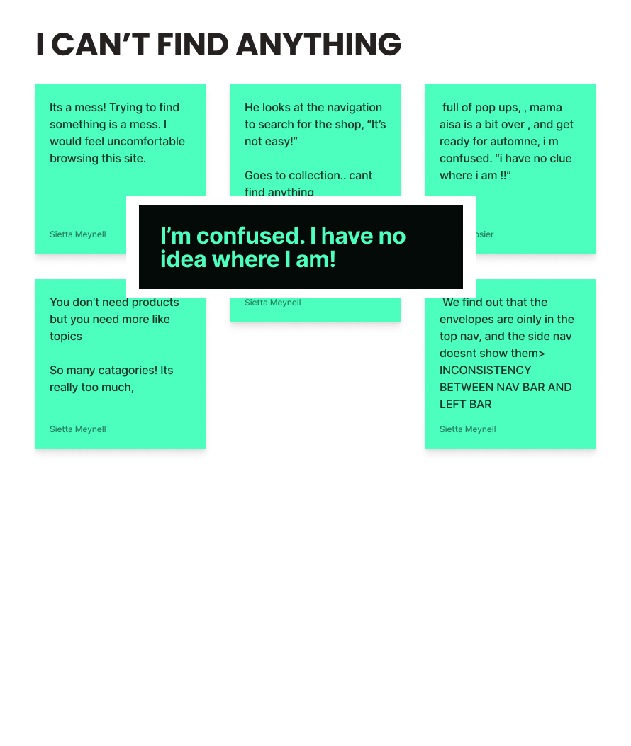
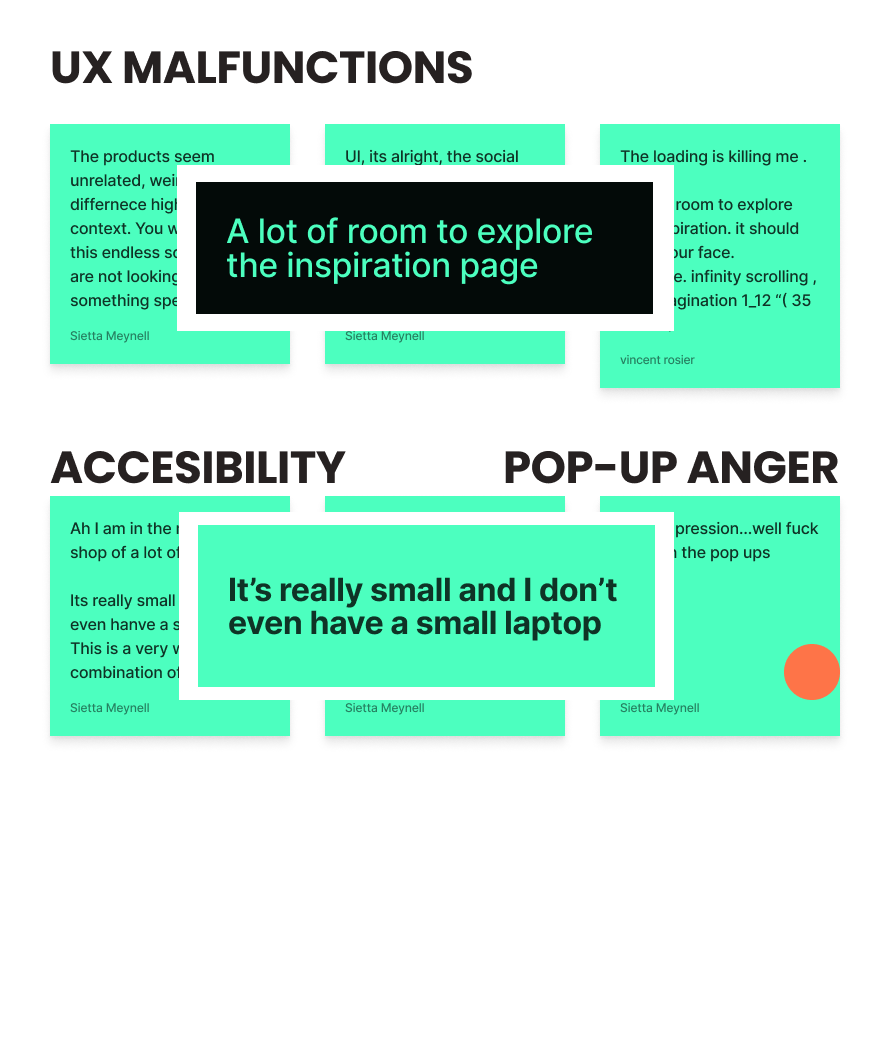
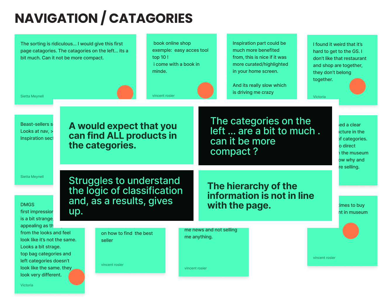
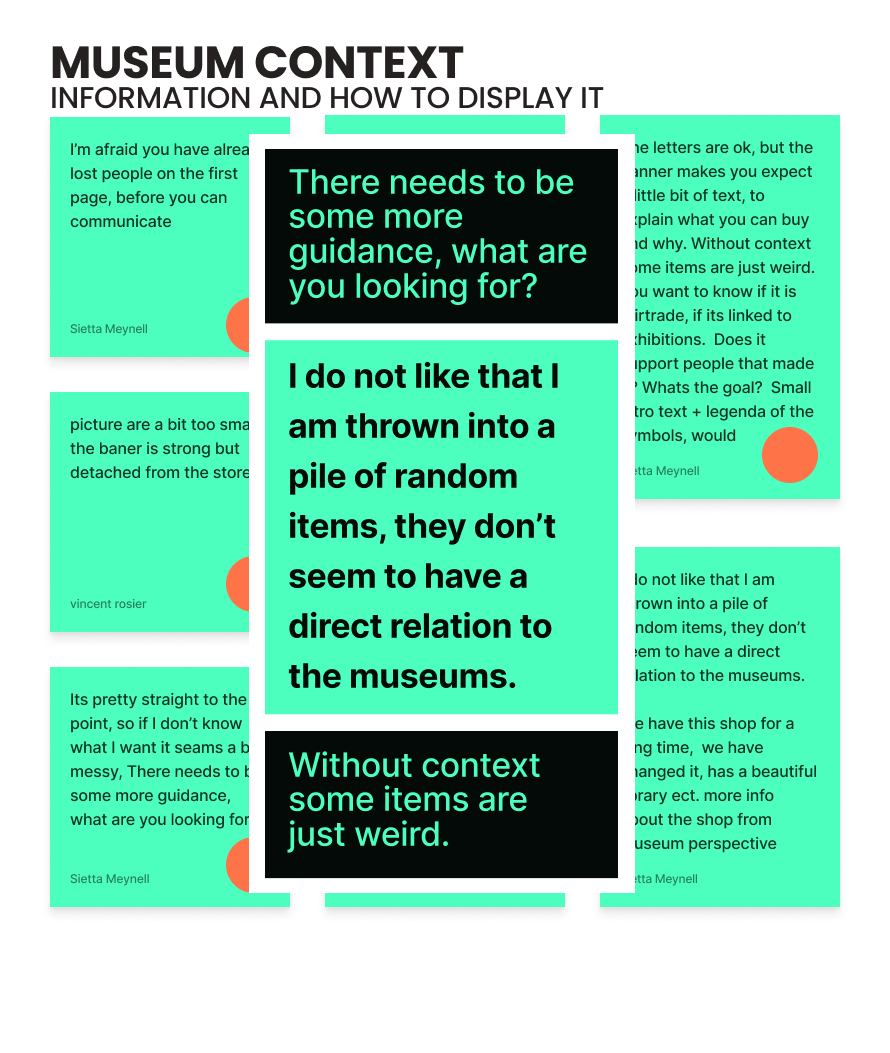
The participants were also given three tasks, involving finding specific items on the website, to assess the relevance and organization of products. These tasks revealed several problems such as unclear search options, poor navigation, and small font size.
Each interview was concluded by seeking the participants' general feedback on their e-commerce experience, which provided valuable insights and helped identify areas for improvement in the website redesign.

INSIGHTS

02/ DEFINE

Based on all this, we could define the focus for our next step:
— Layout for the website (mobile-focused)
— Giving a clearer and bigger space for the museum's content.
— Clearer overall navigation.
— Improve user navigation for a wider audience and mitigate accessibility issues.

USER PERSONA
Our target person is a female professional in her 40s based in Amsterdam who values simplicity and sensory experiences. She is a visual person and dislikes unclear information, making decisions with a clear mindset.

USER JOURNEY
Clear Enter Gift Shop button on the Tropen Museum wegbsite (CTA)
Coherence between product display/info DMGS and the museums
Clear categories on the DMGS website
Standarized layout template
Style guide/ rules branding book
Organised layout with easy access to anticipated products
A responsive mo=bile version of the DMGS
MOSCOW
MUST HAVE
COULD HAVE
Put Inspiration page on an easy to find spot
Enhance the catagories + visual communication
Categories change color when hovered
Thumbnails representing different categories
Legenda that communicates the small icons (sustainable / linked to expo ect)
SHOULD HAVE
Less categories on the DMGS website
Filters
Clear accesible fonts and colors
Each museum page begin with short introduction vibe/goal
Let the products act as ambassadors of the museums
WONT HAVE
Have a different aesthetic
Event or challenges to do online according with the exhibition

HOW MIGHT WE ?
— How might we guide visitors to the Tropenmuseum website to the DUTCH MUSEUM GIFT SHOP?
— How might we make it easier for visitors to the DMGS platform to find the products they are looking for?
— How might we help visitors to recognise the relationship between the museum/identity and their displayed products?

MVP
Tropenmuseum
— Clear link on the museum shop page
— Clear link on the navigation screen
DMGS
— Clear statement of what DMGS is on HP
— Clear hierarchy of categories
— FEWER categories
— Each museum must be able to convey their identity/goal, bringing context to the product
— Add filters
— Rethink a clear gift inspiration and bestseller section
03/ IDEATE

CRAZY 8
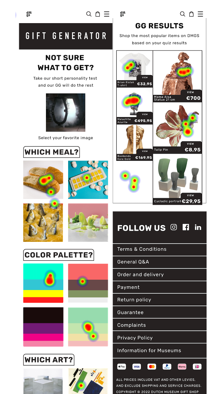
As part of the redesign, our team aimed to create as many layouts and features as possible for the DMGS. Our focus was on having the home page offer options to shop by museum and get inspiration by theme. A new concept came in addition: the "gift generator," a playful feature that allows browsing through categories and finding curated gifts. made the decision to merge the side categories with the top categories into a single, improved version.

MID FIDELITY WIREFRAME
HAVE A TRY
HAVE A TRY

TESTING & VALIDATION
Following a series of user testing and usability-related modifications, a second meeting was scheduled with Jitske. All designs and new features were presented and received positive feedback, including the statement that Jitske already loved the style, even in the wireframe stage. This resulted in approval for the next steps.
04/ INTERACTION DESIGN

CULTURES — DESIRABLE — BOLD — CONNECTING — ACTION DRIVEN

CONCEPT
To ensure that the client-imposed brand values were valid, a small sample of users were tested with a moodboard that was carefully designed by the team.
With the concept of a library index card as a starting point, we sought to create a clean and organized online shop that incorporates a strong and bold identity, using a combination of a rounded sans serif font, RUBIK, and a monospaced font, PT MONO. The use of few bold colors also adds to the fresh look of the platform. The use of micro-interactions will add excitement to the user experience. The goal is to effectively balance the hosting of multiple identities and artifacts within a clean and user-friendly platform.
STYLETILE
After the successful testing stage, we made some modifications to the mobile hi-fi prototype based on the feedback from the participants and the stakeholder. We incorporated changes to the design of some parts of the product cards to better align with the capabilities of the web development team. The testing involved 15 participants, who were given two tasks and then asked to take a desirability test. The meeting with the stakeholder was productive and helped to further improve the design.
HIGH FIDELITY WIREFRAME
Here is the link to the final prototype, which you can try out if you have a Figma account.

USABILITY TESTING
To validate our hypothesis, we conducted user testing on our MVP to assess its effectiveness. We selected 10 participants who were part of our target audience and invited them through Userberry, a testing app. The survey consisted of questions about the usability, overall experience, and desirability of the new design. The results showed that the majority of participants found the new design to be user-friendly and enjoyable, with a high desirability score for the gift generator feature. Based on these results, we can conclude that our hypothesis was supported and the new design works well for our target group.
It was great that we were able to conduct our tests with a diverse group of participants from various countries such as Argentina, France, UK, Germany, and the Netherlands. The ability to conduct the interviews in the participants' native language provided a more natural and realistic experience for them as they would usually have to navigate websites in English when visiting museums around the world. Having the ability to express their thoughts in their own language allowed for more accurate and honest feedback.
The results of the test were very positive, with 60% success on the tasks assigned, and the feedback received from the survey was highly encouraging.


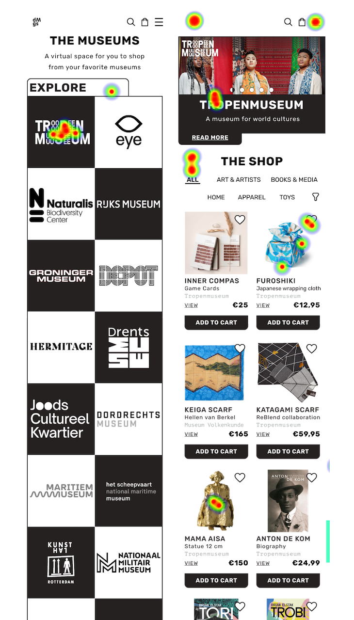


DESKTOP VERSION
Additionally, we created a desktop version with a simpler logo and a clear, easily accessible category menu. The design of the desktop version was based on the mobile application, with a focus on bringing the mobile experience to a larger screen while still prioritizing the mobile design.

CONCLUSION
The next steps for DMGS are to continuously improve and refine the design. This includes finalizing the newsletter template, incorporating the new design aesthetic into the social media channels, and meeting with developers to determine the feasibility of implementing new features. The team is also focusing on improving the usability and accessibility of the platform. It is important to keep iterating and improving to ensure that DMGS continues to provide a top-notch experience for users.
The project was an interesting blend of commerce and culture, with a tight deadline, the added pressure of working with a prestigious museum and the opportunity to work with talented and dedicated teammates.

The Lovies Awards
Recognising European Internet excellence in the fields of culture, technology & business.
The 12th Annual Lovie Award Winners were announced on 17 November 2022, with a virtual show and celebration hosted by comedian Sofie Hagen.
My three teammates and I are thrilled to have won the Lovies Silver Award in the Websites & Mobile Site General-Services category with this project. I am confident that this is not the last achievement we will hear about regarding the Dutch Museum Gift Shop project. 🤫😉🤞🏼