


-
TIME FRAME
Research: 1 day
Brainstorming: 1 day
Visual Design: 4 days
-
TEAM
2 people
Sietta Meynell
Vincent Rosier
-
ROLE
Research
System Design
Interaction Design
Visual Design
-
TOOLS
Figma
Photoshop
Illustrator
-
BRIEF:
-
03/ INTERACTION DESIGN
BRIEF

INTRODUCTION
In this project, we had to practise our UI skills at a rapid pace without the constraints of conducting user research. The app already has content and users. Therefore we could dedicate all the time and energy to improving the Information Architecture and visual skills.

CHALLENGE
Sietta and I had to select a well-known native mobile app of our choice for this redesign. This new design should challenge the existing Information Architecture of the content
We had to redesign a minimum of three screens of our choice and maximum of 7.
No UX research was required.
However, some recommendations were made for the pages selection:
Homepage
Profile
Result
Catalog
Article
Order summary
Product
Payment
01/ EMPATHIZE
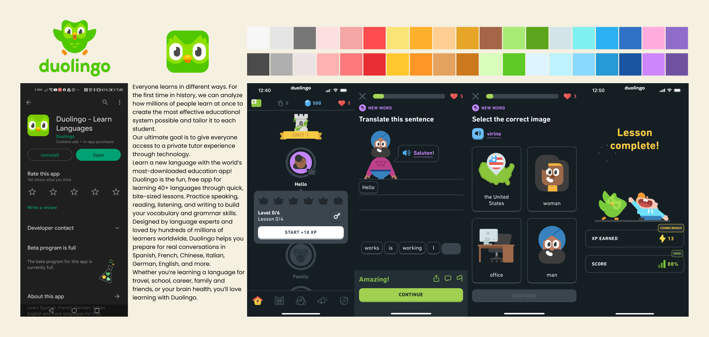
Free of conducting any UX research, based on our own experience as well as some friends of ours we concluded that Duolingo is a really cool app to learn new languages. It is apparently really appreciated — 4.5 stars, 12 M reviews and more than 100 M downloads from the Android store. We can clearly say that it is a really successful app.
WHAT IS IT ABOUT?

Duolingo is a near perfect app for learning new languages in a universally easy way. The UI is instantly recognizable and when going through the brand guidelines a very clear identity is communicated through tone of voice, illustration and design. The duolingo world is inclusive and consists of bright colors and four basic geometric shapes, transporting you back to your first elementary school years when you started learning language as a little kid.
OVERVIEW

Both of us had previously downloaded the app and attempted to learn a new language. However, we both stopped using it for the same reason. It wasn't due to a problem with the app itself, but rather with its appearance. The user interface was not what we expected from a language-learning app. The “childish” and “elementary school” look, as well as the playful interaction, just didn't resonate with us as adults.
PERSONAL INSIGHT

I apologize to Duolingo for the previous statement. I acknowledge the hard work and effort put into creating the app. However, as a user, the overall design and look of the app is not appealing to me. The bright colors, childish characters, and animations are meant to evoke a fun and easy learning experience, but instead, it makes me feel like I am back in primary school and infantilised.
The idea of easy and fun learning doesn't have to be at the cost of a more mature and sophisticated design.
SO, WHAT’S WRONG?

02/ DEFINE
— How to keep the clear and fun way of learning a new language but translate it to a “BIG KID” re-design, using a fresh visual language and implementing the biggest UI trends of the moment?
PROBLEME DEFINITION

We started by conducting a Heuristic analysis of the current app. If something isn’t working, we will be able to fix it in the redesign. One thing was clear between Sietta and I: experiment with new things, step outside of our comfort zone, and wildly creativity has to be in the centre of this project.
STRATEGY

To have a better understanding of what Duolingo was made of, we started by defining a little happy path that could represent a standard Dealing experience. We then literally cloned every screen from that path, made a precise inventory of all the freshly created elements and components. We choose Blogger Sans, an open source font, it was really close to DIN NEXT ROUNDED, the Brand original typography. The Duolingo Brand Book, was a major help to understand the brand DNA (concept, characters, shapes, colors, etc.)
CLONING


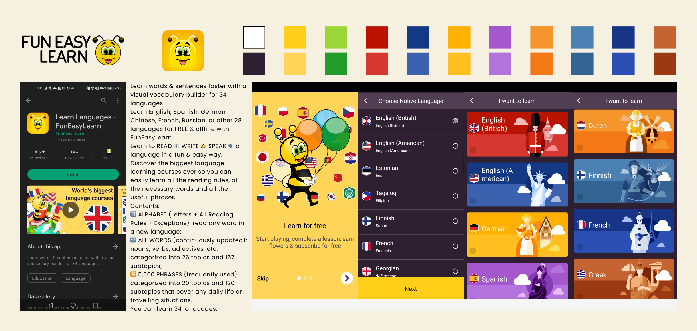
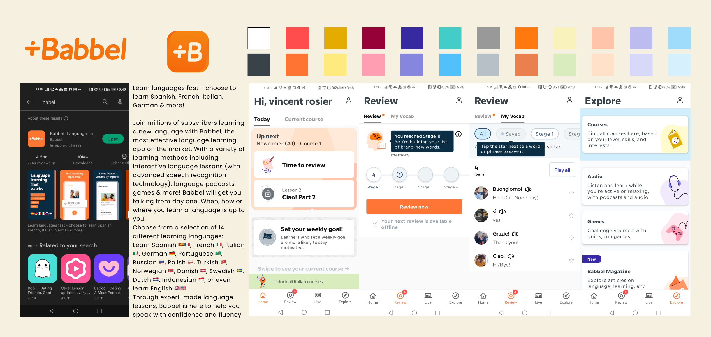
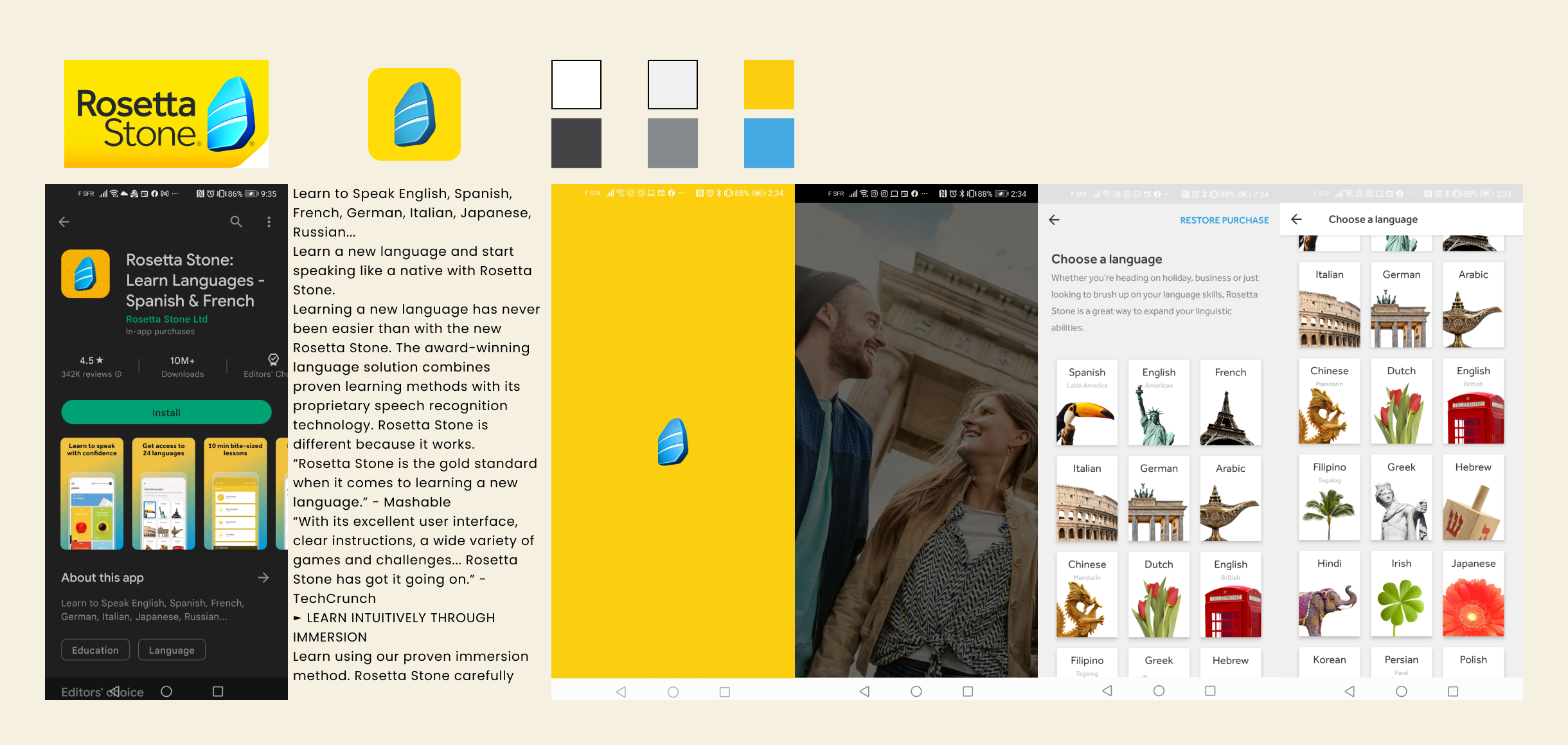
We explored The market of language learning apps, and we could see two different trends:
the first one with a more serious, underwhelming visual approach -Babbel and Rosetta Stone
the second one with a clear kid-style visual approach- Fun Easy Learn.
Those apps on both stores (apple and android) are legions and none are bringing something new, different or fresh. Lucky us that were we wanted to go …
VISUAL COMPETITION ALAYSIS
03/ INTERFACE DESIGN
For this phase, Sietta and I we decided to first go back to our initial discussions to see if it was still in line with what we had discovered so far, if it was possible to incorporate all our wishes and what had to be left behind for another project.
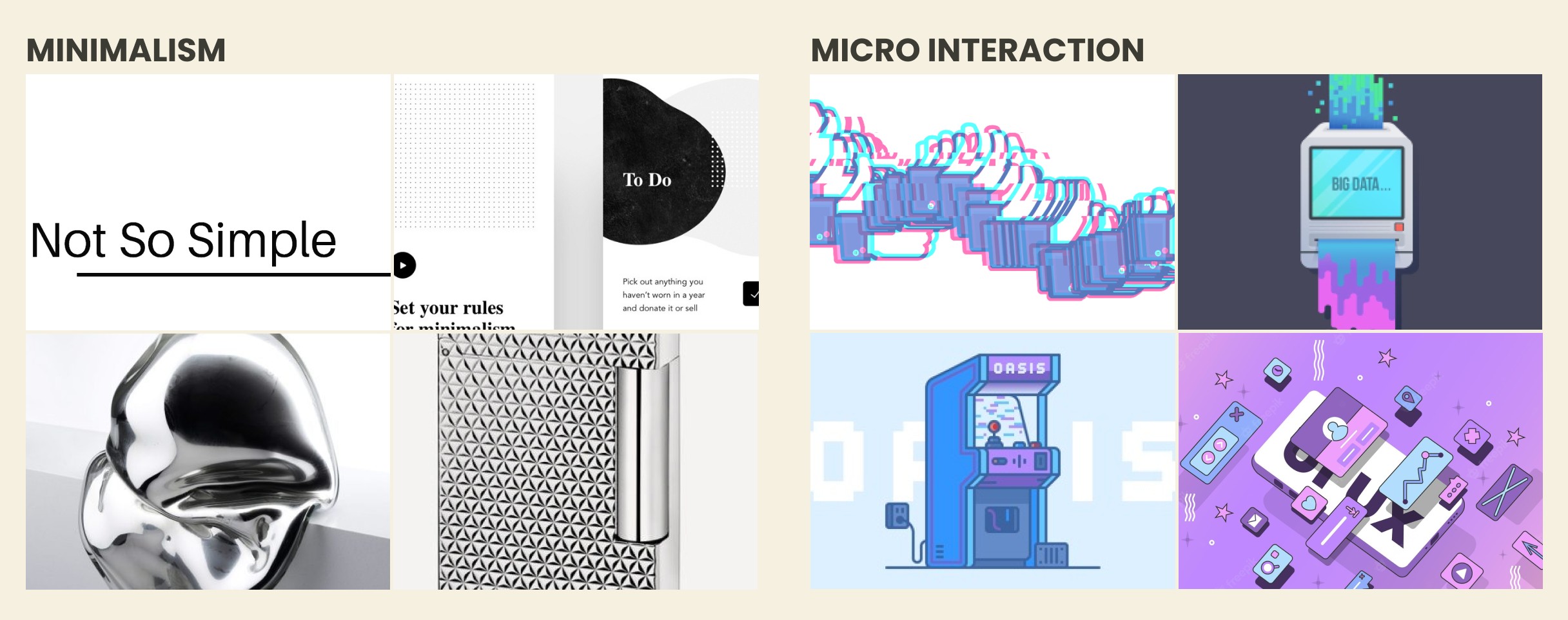
We then went explore the web and collect as much as we could. We both love to work based on a lot of inspirations, it was really cool to share that with someone. For sure, we wanted to develop our Figma skills, work with animations and bring a lot of the cool trends that we had founds: Glassmorphism / Y2K aesthetics / unexpected typography / color overload / neon pastels / textured gradients/ micro animation / scrolly-telling / 90s spirit and more.
INSPIRATION / TRENDS


Communication has entered today in a totally new era that makes us go back to a form of communication that humanity hasn’t used since antiquity.
Today, we all interact with digital-hieroglyphs, using emojis. But not only, what we felt really fascinated about, it’s how on a global scale people are able to share more than words or sentences, more than emotions, but life moments encapsulated into Gifs and Memes. Referring to some cultural elements that you are sometimes not even familiar with but still able to understand! And now a lot of them are a part of our daily communication as a true/real addition to our first language.
Maybe we are here, at the beginning of a Planetary common language?
CONCEPT

OUTERLINGO
For this project we want to be “BIG KIDS” and go wild on learning new UI design and explore the boundaries of learning a new language.
Outerlingo is an app for aliens to learn Esperanto, as they hope to have a nice conversation with humans at some point.
MOODBOARD
The app takes place in their UFO, which is like a nice nebula consisting of animated textured gradients. Here we will play with micro interactions and new design trends, whilst staying true to the current Duolingo UI and way of practice so it is still recognisable for users.
SETTING:
STYLE GUIDE

INTERACTIONS

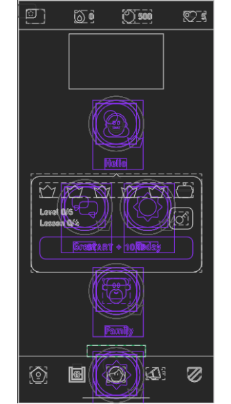
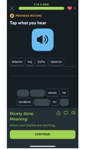
HOMEPAGE
— A full new set of icones, designed in a RETRO SCI FI theme.
— Avatars are now Gifs making references to some commum POP CULTURE vintage moments.
— The background is now moving as a living creature to animate more the page and entertaine the user.

before
after
LOADING PAGE
— This change aimed to give the experience a more futuristic and otherworldly feel, with the spinning spheres adding a sense of movement and energy to the design, making the it feel more immersive and engaging.

before
after
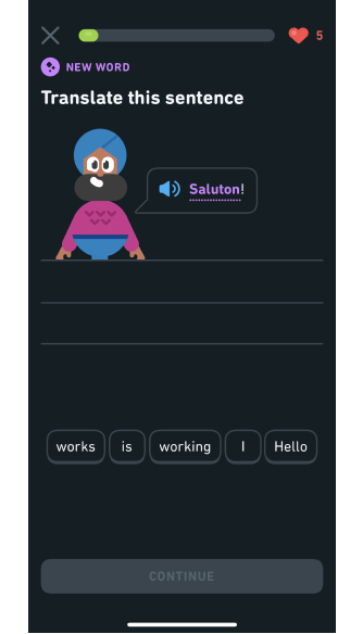
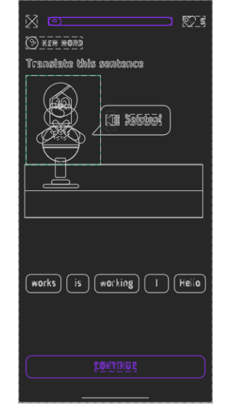
TRANSLATE
— We maintained the same page layout for the exercises but replaced the original character animation with a pop culture GIF, featuring a 90's icon.

before
after
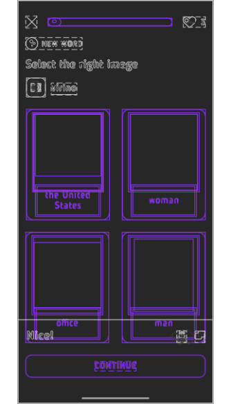
LISTEN AND PAIR
— The animated buttons were designed using popular graphics from recent pop-culture to make them more relatable and appealing to the users.

before
after
PICK THE RIGHT ONE
Incorporating GIFs in our design was a deliberate choice to reflect the modern-day user's lifestyle. The use of GIFs provides a more engaging and dynamic representation of ideas.

before
after
LESSON COMPLETE
— The final animation has been replaced by a massive iconic dancing moment by one of the most influence artist in the current culture.

before
after